UX work
While I am a UX leader, I am still able to be hands-on and am across the tools. This page showcases articles I have written about my UX work and publicly shareable projects.
Learn more about me or view more of my work: Research, Public Speaking, Leadership
Design approach
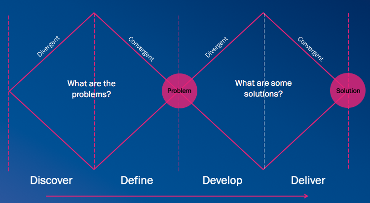
I use design approaches like design thinking and the Double Diamond approach, but some principles make me unique:
I clearly define the problem, goals and scope so I know what needs to be achieved and to create a shared understanding.
Then, I start broad before drilling into specifics, as it’s important to get the user needs and flows right before designing specific screens or interactions.
I show my process to bring stakeholders along the journey, gain buy-in, and showcase that they are getting the best solution, as significant thought has gone into options and the final recommendation.
I also keep the user journey in mind and find ways to help stakeholders understand the user’s context and why solutions may be more complex than they initially thought.
I design with data to establish designs that work for the largest percentage of our audience. For example, many systems personalise designs by using the user’s first name. I ensure designs accommodate real names by using name data. The cumulative percentage helps understand how much of our audience would be covered by designing for each length.
I test designs across common screen sizes to ensure vital information is visible “above the fold”, particularly the main call to actions, and that it is clear there is more to see if they scroll. Read Why the Fold Still Matters
Latest blog posts showcasing my work
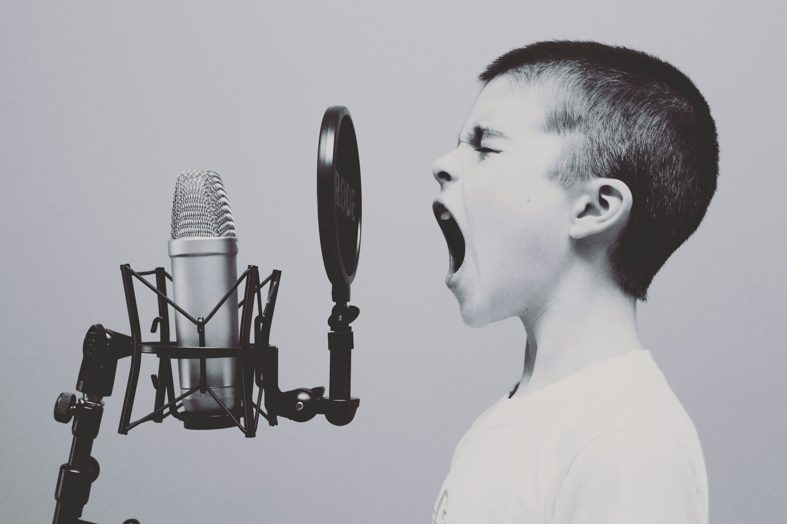
If no one is listening, it's probably a design problem. The tips in the article will help you craft messages people can actually understand and act on.
Is your style guide being ignored? It’s not just a branding issue — it’s a usability problem. Learn why consistency is core, not optional — and how to get teams on board.
Discover why digital accessibility matters for everyone — not just a few — and how small design changes can make a big impact this Global Accessibility Awareness Day.
A quick note on setting expectations and increasing participant comfort (without leading)
More strategic or risky projects often require more evidence to back them up. Traingulating your insights gives stakeholders more confidence to make decisions and to make decisions that they feel more sure of.
Bugs, put simply, are errors or defects in a software system. If you work in tech, you’ve probably heard someone say the half-joke, half-truth line “it’s not a bug, it’s a feature”. Often this is used in jest or to justify not wanting to fix a particularly difficult bug. But when is a bug really a feature? And what does this mean for your users?
Sometimes it feels that UX Research has become synonymous with surveys. They’re cheap, easy & can reach large amounts of users. Sounds great, right? Wrong. Surveys are not enough
Rebranding? There’s a lot online about why to rebrand, how to decide new colours, how to get people on board etc. But how should we alert users to the change? These 4 principles should help you guide your choices
https://medium.com/seer-medical/communicating-a-rebrand-to-your-users-eba127a19e0e
What does a designer want when they tell you their design is at 30%? What feedback should you give?
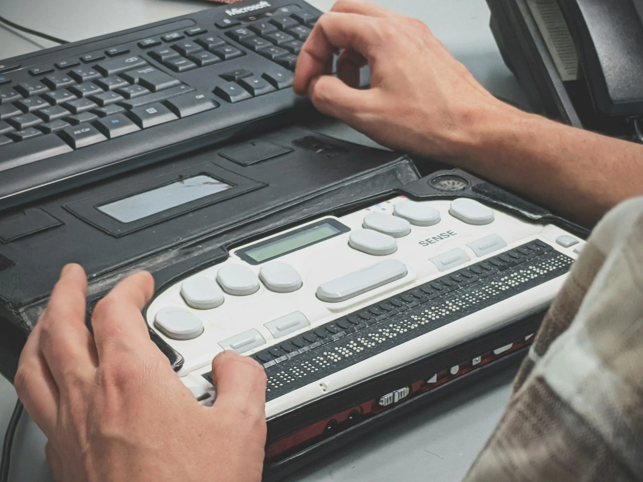
As with everything, practice makes perfect, and while I’ve conducted hundreds of sessions, I hadn’t conducted any with blind users. Armed with secondary research as preparation, I felt pretty confident going into them and learned some lessons along the way to improve next time. Here’s what I learned
Icons are everywhere. But what do they mean? When do I use an icon, and when do I not? What icon means save - a floppy disk, a star, a heart, a pin, a bookmark…? 💾⭐️❤️📌🔖 Read on to find out
After just 0.1 second users start to perceive a delay if your app isn’t doing The Thing™ that they just told it to do. We needed to buy 8.5 seconds. We had to manipulate (percieved) time.
At SEEK we’ve been experimenting with the SUPR-Q. We had a few hypotheses from our first study that we’ve explored through our second SUPR-Q Study. These are:
Tool limitations may negatively impact scores
Drop off could be addressed by improving the survey design
Even with addressing 1) and 2) the NPS would likely still be lower when measured as part of the SUPR-Q than an individual NPS rating, and skew towards aesthetic feedback given the questions asked.
At SEEK we’ve been experimenting with the SUPR-Q. We first ran it as part of a usability test in face to face research (n=5) to trial, and then went full scale using an on site Hotjar poll (n=1,811) to get a more representative sample for our first benchmark. The SUPR-Q (Standardized User Experience Percentile Rank Questionnaire) is an 8 item questionnaire developed by MeasuringU that is used to measure the quality of the user experience. What actually impacts users likelihood to recommend?
Are ghost buttons really as bad as they've been made out to be? Ghost buttons are often touted as low-affordance, and it’s true of many of the examples we see — buttons with poor contrast placed over images making them difficult to use and confounds A/B tests. We say we are comparing ghost buttons and ‘normal’ buttons but we are really testing accessible vs inaccessible buttons, high vs low contrast designs, high affordance vs low affordance designs (and it’s not a surprise that ghost buttons lose). What happens when we test an accessible ghost button against an accessible solid button?
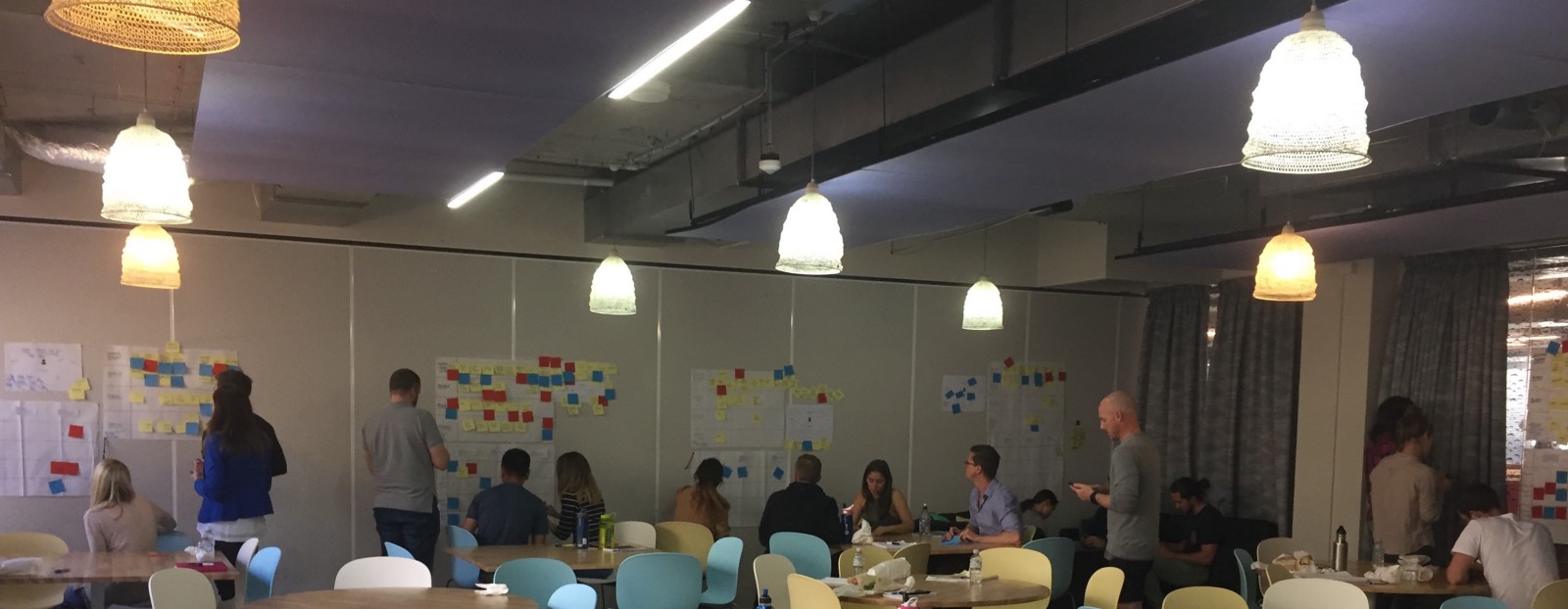
At SEEK we introduced new Hack Skills activities to prep staff for our upcoming Hack 8. We kicked off with a 2 part design thinking workshop. This week we dive in we the practical exercises we taught in the workshops.
At SEEK we introduced new Hack Skills activities to prep staff for our upcoming Hack 8. We kicked off with a 2 part design thinking workshop. Learn what design thinking is in part 1.
We often make assumptions about blind users, however blind users are not homogenous. They differ as much as sighted users in terms of technical ability and search strategies. Just as not every sighted person is tech savvy, not every blind person knows how to use a screen reader well, or utilizes all the power features. This literature review explains the online and search behaviours of blind individuals
We use colour as a signifier for people, places and things all the time. Probably more than you realise. About 8% of Australian males and 0.4% of females are colour blind. Like all people with ‘disabilities’, there are certain things colour blind people can’t do. Design can help make the world more accessible to ensure they can do everything those with ‘normal’ vision can. I explore ways to deign for colour blind users, which often improves the experience for everyone.
We’ve trained users with the five or seven point Likert scale survey questions, where the middle point means “neither likely nor unlikely”. Yet on the NPS a 5 does not mean "neither" it means the users is a detractor. Does the NPS tell us what users really mean?
Error messages, I’ve written about them before. This time I look at global error messages (i.e. messages for a whole form) as we defined them at SEEK.
Empathy empowers us to be better designers — when we understand the user’s perspective, we make products that are better suited to them. At SEEK we have a variety of means to build empathy...
In early web design we always used to talk about the "fold" - the part of the screen a user will see without scrolling down the page. Many think those who still consider the fold to be old school and outdated, but sometimes the fold still matters. If your website isn't the main goal you still need to consider the fold.
Last week a few of us from SEEK went to UX Australia, a conference dedicated to all things user experience. I gave a 10-minute talk at UX Australia which was recorded and will eventually be available but in the mean time here’s a sneak peak.
By now we all know we are not the user, it has been drilled in to us enough times. But how do you design for people you might not know exist. How many genders are there? You might think two if you’ve never met an intersex person.
The natural aversion to change is common in business and makes sense if you take traditional definitions of the word. Without the permission to fail organisations can never take risks, learn from mistakes and grow.
The blog post looks at an 11 phase process that I undertook for a green fields UX project while I was working at Apparel21.
When interacting with your system, your users will come across different types of messages, and you need to display these correctly to communicate the meaning behind them. This post looks at the different types of messages and when to use which.
Research shows error messages increase cortisol (the stress hormone) levels in individuals when they were interacting with computers that faced a system breakdown. Our error messages are physically harming individuals; we have a responsibility to consider the UX as to not affect our users health.
User Experience is Human Experience. Are your interfaces making the world a better place? I like to think our work with gender, is.
MASTER’S COURSEWORK design PROJECTS
Para-Stroke: Symptom onset to treatment fast
Treatment seeking is delayed as patients do not recognise the symptoms of stroke. This solution helps identify symptoms quickly.
Public Transport - User Needs Analysis
Analysis of metro-Melbourne commuters needs and how well current technologies are meeting these.
Family room: reducing email overload
For the 2013 OzCHI Student Design Challenge, we designed a solution called Family Room, to reduce email burden.

Design hire number one and don't know what to do? Read about the 6 steps I used to set up a design practice from scratch