

Icons are everywhere. Download one of thousands of free vector icon kits from the Internet™️ and start throwing pixels in the shape of hamburgers, kebabs and magnifying glasses over your artboards and you’ve got yourself a design. But have you stopped to think when to use an icon, and when not to use one? When to use which icon?
This piece shares some musing, and some research, from the SEEK UX team regarding iconography, which hopefully makes you a little more aware of the UX complexities behind these little 8-bit pieces of art.
Icons as static elements
Static icons are those used as decorative elements, to communicate a discrete piece of information or to help with way finding. Like everything, they can be both good and bad.
Icons are good
Well designed, and easily recognisable, icons can quickly communicate information a user may be scanning for — for example, scanning a page of search results for hotels that have WiFi, or the number of bedrooms in a property. We see this in symbolism for accessible car parks, signs for bathrooms and the universal symbol for poison.

Realestate.com.au icons for the number of bedrooms, bathrooms and car spaces for a property listing
Icons save space, and reduce cognitive load by removing the need to re-read the same piece of information against every listing, reducing friction.

REA design without icons increases friction
Icons can improve the look of an interface, adding visual appeal which is known to enhance the (perceived) UX and usability of a product. This is known as the Aesthetic-Usability effect and you can read about it here (NN/G).
When icons are paired with text, it can improve accessibility by giving an alternative mechanism to relay information — text with a visual clue — which is good for individuals with cognitive issues, low vision who cannot see the icon properly etc.

NAB’s Chat icon is clear
Icons can also help people who speak (or read) the language of the interface as a non-primary language (or not at all) navigate. I might not be able to read the text on the interface, but icons can give me an understanding of how to navigate around, or how to find what I’m looking for. This is also true in the real world and is why we have standardised icons for bathrooms, airports, elevators etc.

Despite my poor Catalan I was able to successfully wash my clothes in Barcelona thanks to icons
Icons are bad
Badly designed icons can add confusion when we don’t know what they are trying to represent to us, especially when they are not accompanied with text or a tool tip.

Without the text, does a flower represent ‘spa and wellness centre’?
Icons for icons sake provide little value and add noise to the interface.

In the design on the left, the icons do not add any value so we removed them and reduced noise.
Icons without alt-text, are confusing for screen reader users. Particularly if it just reads out something like ‘Star’ instead of ‘Save Job’. Text labels help reduce these confusion for sighted users too.
Icons are subjective. The same icon can mean different things on different websites (e.g. a star for ‘saving’ and a star for ‘rating’). The same icon can mean different things in different contexts (e.g. an error for share, reply, forward, next). Icons can be indecipherable.

What do al the different laundry icons even mean? Source
Icons purpose can be confusing
Is this a static icon or an interactive element? Sometimes icons are clickable and perform an action, this can be especially confusing when clickable elements are directly next to non-clickable elements and in flat design.

The star is thicker, so I know it’s clickable — but does the average user? It’s separated from the other, non-action, icons — does that mean clickable to the average user?
We need to make sure that it is obvious this element is clickable, what we call affordance — particularly when it’s just an icon with no text.
Icons as interactive elements
Seen an item you want to easily find again on an app or website? Just hit the handy dandy ‘save’ icon! But what, exactly, is a save icon?
Which icon, when?
It used to be an icon of a disk in the age of skeuomorphism — where an object in software was represented with its real world counterpart, in this instance a floppy diskette 💾. The floppy disk never got an upgrade as we moved from disks to CDs to USBs and to the cloud, but its meaning is still known. You’ve probably heard the folklore story of the child who said “Wow, someone 3-D printed the Save Icon!” upon seeing a 3 1/2 inch floppy disk IRL.
You’ll still see this in Microsoft Office products today.

Microsoft Save icon
To put aside a property on Airbnb click the heart ❤️

Airbnb Save a Property
I love this place, maybe I’ll stay here!
Although maybe I don’t love this place, maybe it’s just something I want to put aside for later to further evaluate, as it may meet my needs as a traveller. Airbnb has likely chosen this as the star icon is already used for ratings, and maybe we want to distance ‘love’ from saving, particularly in cases where it’s not something a user is enjoying doing (something that is a necessity, not a fun holiday).
Products like Twitter blur this line — I could be hitting the heart as social validation (like Instagram and Facebook) or I could be using it to save it for myself to retrieve later. Not wanting to use a heart is especially true where it already means something else, a like or reaction, such as on Instagram and Facebook who have gone back to skeuomorphic design and decided on a bookmark to represent ‘save’ 🔖. Find your place with a physical object like you did in a book (or do on your Kindle).

Medium bookmark a story for later
What about a star? ⭐️ If I ‘star’ something to save, does this mean it is my favourite? If a user comes back and sees one item in a listing has a star does it mean we are recommending it for them as a good match? Or did they save it?

Star a message on Slack
Amazon has avoided these issues all together, by simply having a button with the text ‘Add to List’, sans icon.
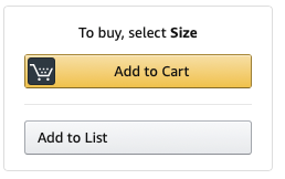
Amazon — Add to List
Icons with text, and appropriate affordance, have much clear actions and are more usable. It also makes the actions much more accessible to those using screen readers, people with low cognition etc.

Labels add context to icons
Understanding of Icons
In addition to the icon actions being confusing, there are very few icons that are universally understood.
At SEEK we conducted a piece of research regarding understanding of iconography.
We first asked participants what icon they would expect to click to put a job aside for later (we avoided the word ‘save’ as we did not want to prime them). This was a free text answer where they could explain what symbol they would expect to see.
Imagine there is an icon (a symbol or a picture) hidden by the black square in the image above, and this icon is what you would click to put the job aside for later. What symbol or picture would you expect?
The most popular response were:
A star icon (24%)
“Save” as a generic answer (15%)*
Floppy disk (11%)
File / filing cabinet (6%)
*It is not clear what respondents meant by “save”, as many did not elaborate. Some wrote responses such as “The floppy disk save icon” or “the save icon i.e. diskette”, however it is not clear if all “save” respondents meant this.
A star also is usedon the SEEK website, so it’s possible this is skewed to respondents answering what they know is behind the black square.
We asked the same question as a Twitter poll, with 4 options, and the majority answered floppy disk best means save!

Twitter poll — which icon means save?
A floppy disk may still be universally understood, but as designers we don’t want ancient technology cluttering our interfaces, so we’ve moved to a Star or a Heart. Do we need an icon at all? Why not just simply a ‘Save’ button?
We next showed participants 4 icons isolated from the interface and without labels, and asked what words or phrases or actions they associate with the icon.

What words, phrases or actions do you associate with this icon?
None of the icons were universally understood and are open to interpretation based on participants’ previous experiences and tech-savviness. This suggests keeping the label next to icons will increase usability and ease of use. It also follows accessibility guidelines where we should not just rely on visual clues to describe an action — context + visual cues = usable
Respondents echoed this sentiment in their text responses:
“Most things online confuse me, why can’t every sight[sic] use the same shapes to do the same thing?”
“Icons can be a little confusing as they are quite subjective to the user & the situation they are used in”
“I like to keep things simple — searching for work is stressful enough without having a complicated site to navigate in the process”
The bookmark icon was the most likely for participants to state they did not know what it did, however many did understand that it would put the job aside for later. Some thought it meant the job / company was award winning or a good match for them. Overall, it was interpreted to mean:
Bookmark (38%)
Don’t know / not sure (11%)
Save (11%)
Flag (9%)
The Heart icon was associated with love and recognising social media posts (prior knowledge from Instagram or Twitter). Respondents who were familiar with SEEK and answered it was used for Saved Searches, however overall respondents did not associate this as strongly with putting aside something for later, more with positive emotions (Love, like, happiness). The heart icon was understood to mean:
Love (54%)
Like (35%)
Favourite (21%)
Some really didn’t like the idea of a heart being used:
“Love, not applicable for job advertising”
The Star was understood to mark something for later or as important. However, it was also thought to be an indicator that a job was a good match for them, or the rating of the company. The star was seen as:
Favourite (37%)
Save (20%)
Star (17%)
Important (10%)
Rating (8%)
The share arrow was overwhelmingly misinterpreted to mean “forward” to “next”, however was shown out of context :
Go forward (or forward an email?), next or to the next page (81%)
Replying to an email (10%)
Share (8%)
Prior knowledge influences understanding
Like anything we design, we need to be testing the understanding of our icons with out target users. A triangle to one person may just be a triangle, but to a physicist or mathematician it may be clear that it means ‘change’.
I once won a game of Pictionary with the below scribble in 3 seconds. What does this mean? To you, probably nothing. But to me, and my Pictionary partner, it’s my poodle Penny. Our competition was not happy.

Does this mean Penny to you?
Context matters
An arrow next to another arrow facing the other way likely means ‘next’, whereas if it were next to a heart it may be clear that it means ‘share’. Test icons in context.
If you like it, then you should put a label on it.
If you want the most users to be able to understand what icons do, use labels. User Testing found users were able to correctly predict what would happen when they tapped an icon with a label 88% of the time. For icons without labels, this number dropped to 60%. For bespoke unlabelled icons this dropped further to only 34% of the time. Read more about their research here.
TL;DR- Should I use icons? Which icons?
It depends.
Ask yourself, does using icons here:
Assist the user in finding what they are looking for?
Reduce cognitive load?
Add to the visual appeal of the product?
Is the chosen icon:
Understandable to the users, in the given context? Has it been tested with the target group for understanding?
Clearly clickable?
Accompanied with text to increase usability and understandability?
If you answered yes to the above, you can probably use an icon.
Don’t use icons when they:
Appear to provide no value;
Clutter the interface;
Are open to interpretation.