
Blog posts

Design hire number one and don't know what to do? Read about the 6 steps I used to set up a design practice from scratch



If no one is listening, it's probably a design problem. The tips in the article will help you craft messages people can actually understand and act on.

Is your style guide being ignored? It’s not just a branding issue — it’s a usability problem. Learn why consistency is core, not optional — and how to get teams on board.

Discover why digital accessibility matters for everyone — not just a few — and how small design changes can make a big impact this Global Accessibility Awareness Day.


A 9-step system to streamline the home-buying journey. Learn how to evaluate properties effectively using spreadsheets, prioritise needs and budget, manage lists, organise inspections and confidently make decisions and auctions- even under time pressure.

In 2015, I embarked on the journey of buying my first home. At that time, I wrote a blog post critiquing the UX of real estate websites through a, somewhat sarcastic, persona named ‘Kayla’ and listed out ‘her’ (my) user needs and how they weren’t being met. Discover how real estate websites have evolved from 2015 to 2024 through a personal lens. Spoiler alert – it still sucks, but it sucks a little less.
In this blog post, I evaluate how current real estate platforms address user needs such as viewing new properties, staying within budget, accessing accurate information, and managing inspection schedules. It suggests key improvements and practical recommendations for improving real estate website UX.


A quick note on setting expectations and increasing participant comfort (without leading)

More strategic or risky projects often require more evidence to back them up. Traingulating your insights gives stakeholders more confidence to make decisions and to make decisions that they feel more sure of.

Bugs, put simply, are errors or defects in a software system. If you work in tech, you’ve probably heard someone say the half-joke, half-truth line “it’s not a bug, it’s a feature”. Often this is used in jest or to justify not wanting to fix a particularly difficult bug. But when is a bug really a feature? And what does this mean for your users?

Handed off your designs only to find many questions raised during development? Remembering to design these 5 types of messages can help make development smoother and ensure better user experiences.

Don’t forget UX in your job applications. All you need to do is utilise your core UX skills — think about your users (in this case the hiring manager), consider their context of use and design to make things simple for them.
These simple tips to improve your resume and cover letter apply regardless of what the hirer is asking for. Some of these may seem obvious, but the obvious is not always so when people haven’t slowed down to consider the hirers’ perspective (or when first applying for jobs).

Sometimes it feels that UX Research has become synonymous with surveys. They’re cheap, easy & can reach large amounts of users. Sounds great, right? Wrong. Surveys are not enough

I took a pause and then answered four things I am sure they were not expecting. My tips are about how to improve the health and happiness of your work life.

COVID-19 has changed onboarding and forming connections with colleagues

When to use the T-Shape designer model, the broken comb model and how a spider web helps assess competencies
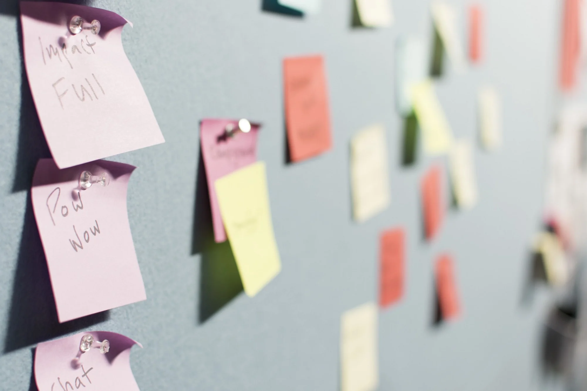
“Design thinking” and “the double diamond” are perhaps some of the most abused terms in tech today. While exploring more than one solution is a step in the right direction, design thinking without design research is only a quarter of the way there…

So often when we state “this is unethical” we really aren’t applying ethics at all. At best we are saying “I think this is wrong, so doing this is against my ethics”. In my latest post I give an overview of ethical theories and apply these theories to some “unethical tech” scenarios. I show most of them can be argued as ethical by applying these theories. I end with what is, I hope, a better frame to have these discussions going forward.
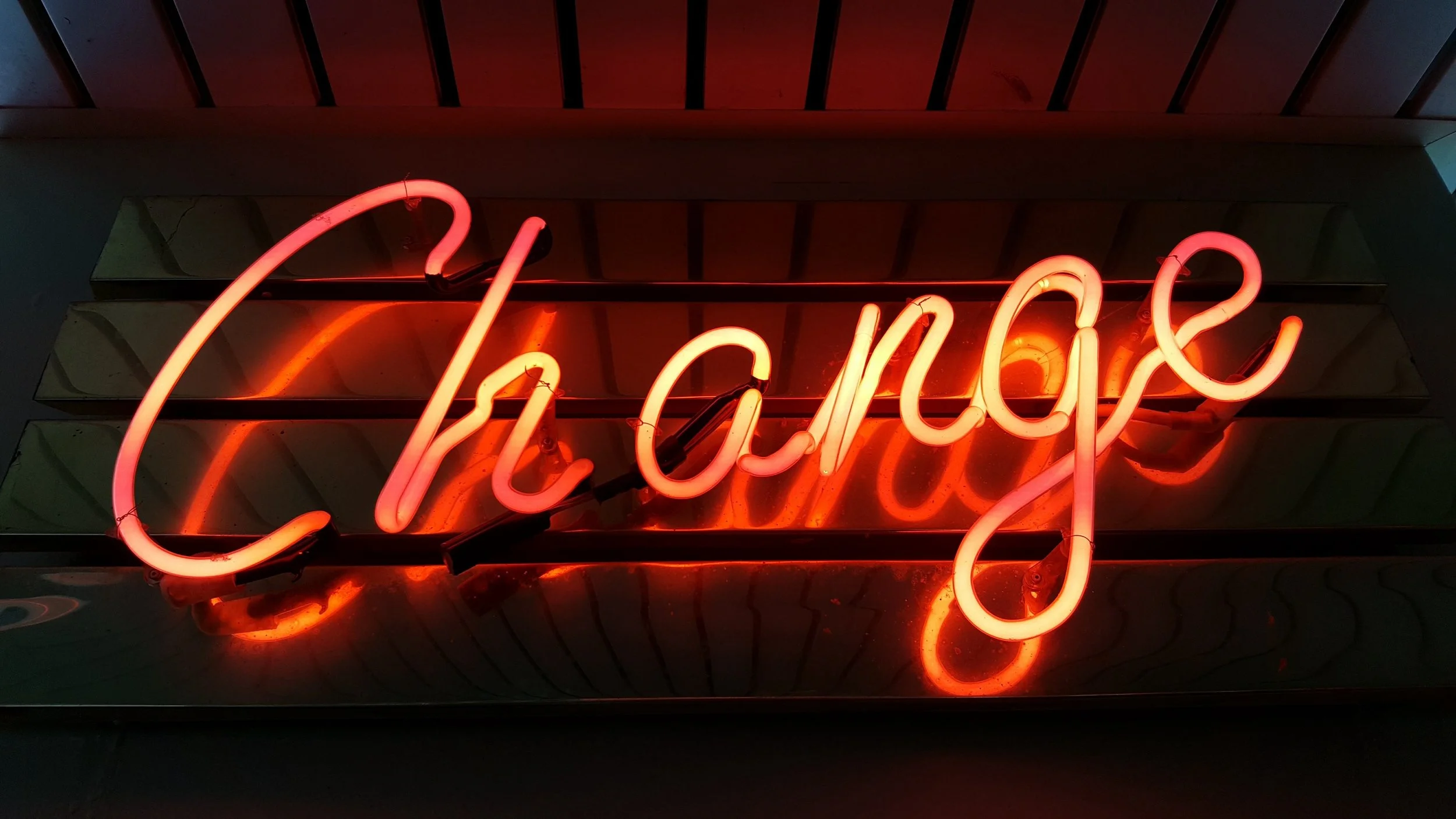
Rebranding? There’s a lot online about why to rebrand, how to decide new colours, how to get people on board etc. But how should we alert users to the change? These 4 principles should help you guide your choices
https://medium.com/seer-medical/communicating-a-rebrand-to-your-users-eba127a19e0e

It’s only 5 people. That’s an assumption. It's just opinions. UX research isn't _real_ research. Sound familiar? Yeah, us too. That's why Caylie Panuccio and I wrote this post. If you’re a UX Researcher this article will help you fight some battles. If you’re not, it will help you understand the validity of qualitative research methods a little better.

It has been said that the only 2 industries who refer to their customers ‘users’ are drug dealers and tech companies. But who is actually worse?
All of my posts will be exclusively on Medium. I will, however, post here with a link to each new article (and the Friends link so that you by-pass the pay wall). I know that’s not the best experience for readers on here (having to click twice) but I promise it will be a better experience to read there.

What does a designer want when they tell you their design is at 30%? What feedback should you give?

I am fortunate enough that I occasionally get to speak on panels, many with students. And because I’m a UXer through and through, I do a bit of research before the panel. Here’s what 8 designers wish they could tell their younger selves…

I know, I know — skeuomorphism ? What is it, 2012?
But, I’m not talking about Skeuomorphic design (where digital things look like real-world things e.g. your bin icon looking like a ... well… bin), I’m talking about skeuomorphism in the way users think about your product in relation to other products in the marketplace.

As with everything, practice makes perfect, and while I’ve conducted hundreds of sessions, I hadn’t conducted any with blind users. Armed with secondary research as preparation, I felt pretty confident going into them and learned some lessons along the way to improve next time. Here’s what I learned
My older posts can be found here.
Enjoying what you read?
View all my posts on Medium (where I’ll get royalties) or shout me coffee to fuel my writing.
Whether I’m coaching an associate designer or managing an experienced team, my role is to build trust and psychological safety and help people thrive. The same curiosity I bring to understanding users is the mindset I bring to understanding the people I lead.
I’ve collected tactics over many years through self-directed learning (talks, readings, podcasts), structured professional development (conferences, courses, Melbourne Business School) and from other leaders.
You’ll notice a pattern in every tactic. None of them involves guessing.
They also aren’t forms to complete or assessments to run. They’re structured conversations to have with your team members, individually, early in your journey together