


A few bar tab apps have being propping up lately, so I decided to give one a go. I happened to choose Clipp because they had a special offer code, and who doesn’t like discounts on drinks. So, what of the UX?

Whether I’m coaching an associate designer or managing an experienced team, my role is to build trust and psychological safety and help people thrive. The same curiosity I bring to understanding users is the mindset I bring to understanding the people I lead.
I’ve collected tactics over many years through self-directed learning (talks, readings, podcasts), structured professional development (conferences, courses, Melbourne Business School) and from other leaders.
You’ll notice a pattern in every tactic. None of them involves guessing.
They also aren’t forms to complete or assessments to run. They’re structured conversations to have with your team members, individually, early in your journey together
Design hire number one and don't know what to do? Read about the 6 steps I used to set up a design practice from scratch
If no one is listening, it's probably a design problem. The tips in the article will help you craft messages people can actually understand and act on.
Is your style guide being ignored? It’s not just a branding issue — it’s a usability problem. Learn why consistency is core, not optional — and how to get teams on board.
In 2015, I embarked on the journey of buying my first home. At that time, I wrote a blog post critiquing the UX of real estate websites through a, somewhat sarcastic, persona named ‘Kayla’ and listed out ‘her’ (my) user needs and how they weren’t being met. Discover how real estate websites have evolved from 2015 to 2024 through a personal lens. Spoiler alert – it still sucks, but it sucks a little less.
In this blog post, I evaluate how current real estate platforms address user needs such as viewing new properties, staying within budget, accessing accurate information, and managing inspection schedules. It suggests key improvements and practical recommendations for improving real estate website UX.
The Apple Watch is set to hit stores in April, and there's been lots of speculation of what your favourite apps will look like, and what use it will be. What I want to speculate on is how people may use the heartbeat sharing feature - what possible use cases do users have for this? I can think of a few that may be used, so perhaps this feature is nothing to scoff at.
UXmas is an advent calendar for UX professionals - containing articles, thoughts, drawings and freebies from UXers from all over.
This is just a quick note to update you that after following UXmas since it's inception in 2012 I was the present your true love gave to you on the 7th day of UXmas! You can read my article about Automagic here and follow UXmas in the countdown to Christmas at www.uxmas.com

Quality Triangle
If you've done any sort of formal training, or first year university IT or business classes, you may be familiar with the quality triangle. The quality of a product depends on your ability to balance the factors at each point of the triangle - Time, Scope, Budget.
For us UX designers we work in a different triangle which I'd like to introduce - the triangle of needs.

Triangle of Needs
UXers need to balance the business needs, the user needs and the tech needs. The inside of the triangle is the "needs", or the requirements / stories for the Product to be built.
Researching into travel money cards to use while overseas I thought I'd made the best choice - no transaction fees, pretty fair exchange rate for USD, no load fees, no exit fees. I couldn't find the flaw. While the money side of things is still fine, positive UX is lacking.
I use a password manager so my password was something complicated. Upon login I was asked to enter a few random characters from the password. What is this?! This makes no sense to me, and doesn't seem any more secure to me - if someone already knows my password they too will know the values in these positions. Because there is no way to save the password in the app, and it was too difficult to figure out what the nth value was, I ended up changing my password to something simpler. BAD.
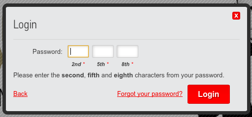
The app requires you to enter your travel card number and password every time. There is no option to save the password which is annoying and slows me down every time I want to use the app. About 90% of the time I get an error straight after logging in - making me lose faith in the app.

At first I wasn't even sure that the card even had a pin. After trawling through the website I found that there was a pin. When I tried to access it via the app I kept getting an error, and was directed to call. I was taken to an automated menu which asked me to enter a whole bunch of numbers and "press the hash or square key" (Square key?)
After listening to the automated menu, I knew I needed to press 1 which I did. But I was forced to listen to the entire automated menu before it would register what i had pressed. Making me waste time before I even get to hold? Not impressed.
One of the audio prompts asked me to enter my date of birth, and of course I didn't bother listening to the rest of the recording - I simply entered "DD-MM-YYYY" and got an error. Apparently what they actually wanted was my birthDAY (i.e. DD-MM)
I found out the birthday vs birth date issue after talking to a human on the phone to troubleshoot what I did wrong (and was blamed for it, rather than recognising the bad design of the automated system) and put back to the automated menu to re-do all the steps again. Couldn't the human have helped with my request.
The card took 3 days for funds to be loaded! Because that's what you want when you're travelling and need money, to have to wait three days for it.
The app had no visibility of money that you had transferred and was pending, or of pending transactions so you really had no idea what was going on with the state of your balance.
Maybe some fees would've been worth it to have a more enjoyable experience! Next time, I will use a different card.
I'm recently back from a holiday. A proper holiday. As in, not staying a few extra days at the end of a conference, or after business, but a proper holiday. But, being me, I of course still had UX running through my head.
In the process of looking for flights, on multiple websites, I became extremely frustrated. The UX of travel is highly documented elsewhere (think the posts on re-designing boarding passes) and I've not analysed anything in great detail. Just a passing note to say: why can't I search for flights based on the arrival time, as opposed to departure time. Think about it, when you are on holiday you might need to be somewhere by a particular time, and it would be much easier than trial and error of different times and looking at when they arrive (especially because of the time difference, even if you know it's a 14 hour flight that math is well beyond my comfort level). The websites that are trying to aggregate and provide a better experience should consider putting in the arrival time feature.
What do you think? Would you use this feature?
I was recently staying in a brand spanking new house, literally brand new no one else has stayed in there before. It's interesting to see the few issues that have arose from incorrect installation as the builders weren't considering UX.
Remembering that UX is not just what happens when we interact with the product, but the feelings and experience before, during and after use.
Picture this. It's 10degrees (50F) and you want a shower to warm up. The house is cold because it's new and heaters have never been turned on. It's tiled which isn't helping with the temperature and you're covered in goosebumps. You get in to the shower and you see a faucet that looks like the one pictured. Generally, turning left is hot (red) and turning right is cold (blue), however this particular faucet had blue indication on the right (hot) and red on the left (hot). So, despite my natural expectations, I followed the labels on the tap and nothing but cold water came out. I waited a few seconds and the water had not warmed. I turned on the bathroom sink to make sure the hot water was working and confirmed that it was. With arms going blue from the old, I decided to try moving the faucet to the other side where it indicated cold water would come out. A viola hot water!
Bad UX indeed.