


Here at SEEK we were lucky enough to get our hands on a few Apple Watches, which have been making the rounds for iPhone users to trial. Yes, only iPhone users, because the Apple Watch is essentially useless without an iPhone.
Cranking it up to 11

From Smart to Dumb

The Experience of Trialling the Apple Watch

The Different Type of Messages

The UX of Claiming Airline Points

Quantum UX

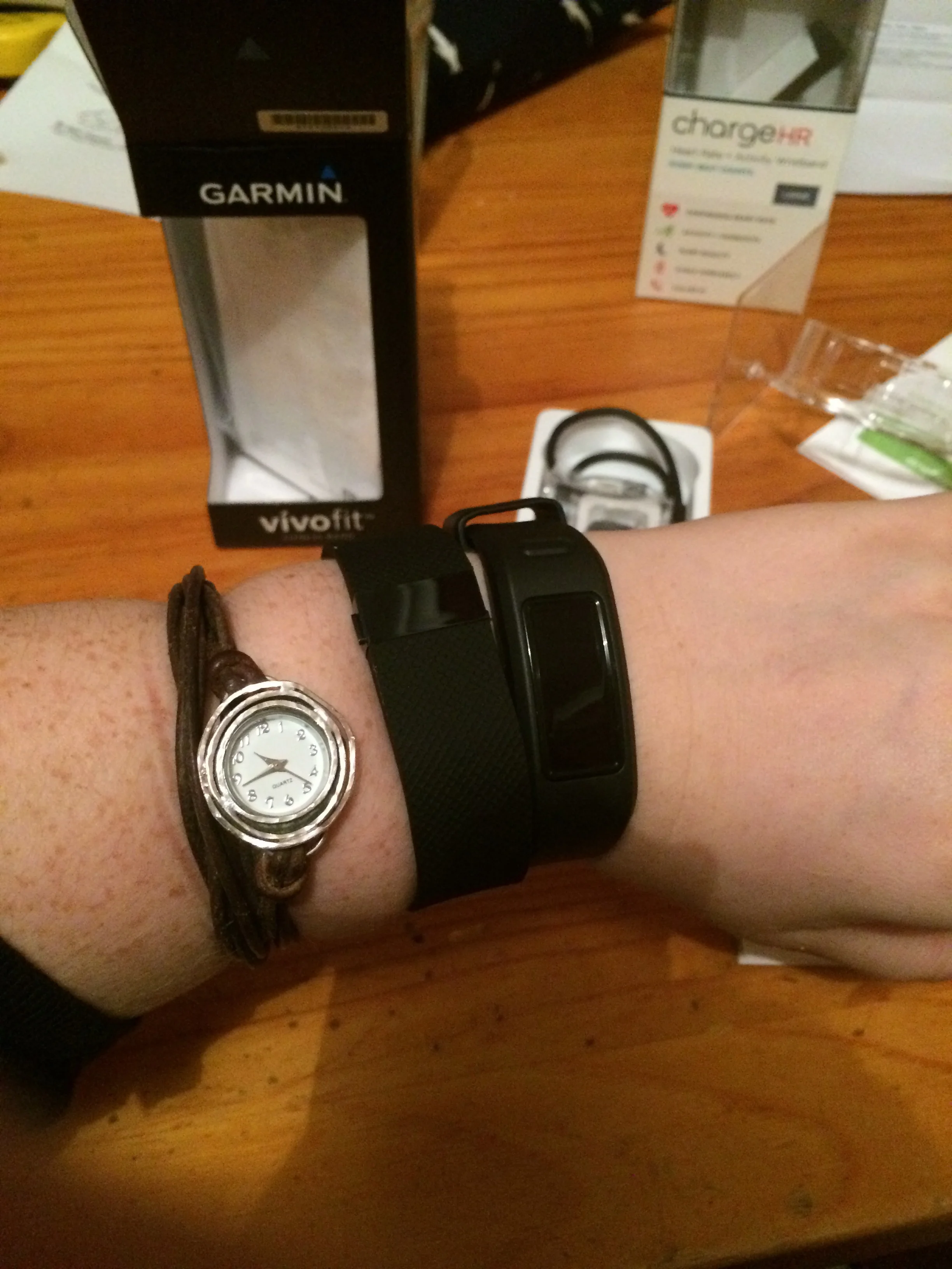
Review: Fit Bit V. Garmin

UX is About Human Experiences

The New McDonalds Experience
Bar Tab Apps - Clipp

Getting Kids Interested in IT

Apple Watch - Sharing your heartbeat

The Apple Watch is set to hit stores in April, and there's been lots of speculation of what your favourite apps will look like, and what use it will be. What I want to speculate on is how people may use the heartbeat sharing feature - what possible use cases do users have for this? I can think of a few that may be used, so perhaps this feature is nothing to scoff at.
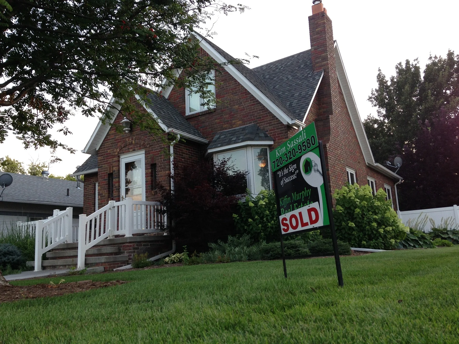
UX of Real Estate Websites
Do You Want to Save Children with Cancer?

UXMas
UXmas is an advent calendar for UX professionals - containing articles, thoughts, drawings and freebies from UXers from all over.
This is just a quick note to update you that after following UXmas since it's inception in 2012 I was the present your true love gave to you on the 7th day of UXmas! You can read my article about Automagic here and follow UXmas in the countdown to Christmas at www.uxmas.com
Triangle of Needs

Quality Triangle
If you've done any sort of formal training, or first year university IT or business classes, you may be familiar with the quality triangle. The quality of a product depends on your ability to balance the factors at each point of the triangle - Time, Scope, Budget.
For us UX designers we work in a different triangle which I'd like to introduce - the triangle of needs.

Triangle of Needs
UXers need to balance the business needs, the user needs and the tech needs. The inside of the triangle is the "needs", or the requirements / stories for the Product to be built.
Travel Money Cards
Researching into travel money cards to use while overseas I thought I'd made the best choice - no transaction fees, pretty fair exchange rate for USD, no load fees, no exit fees. I couldn't find the flaw. While the money side of things is still fine, positive UX is lacking.
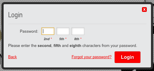
1. The password
I use a password manager so my password was something complicated. Upon login I was asked to enter a few random characters from the password. What is this?! This makes no sense to me, and doesn't seem any more secure to me - if someone already knows my password they too will know the values in these positions. Because there is no way to save the password in the app, and it was too difficult to figure out what the nth value was, I ended up changing my password to something simpler. BAD.
2. The app
The app requires you to enter your travel card number and password every time. There is no option to save the password which is annoying and slows me down every time I want to use the app. About 90% of the time I get an error straight after logging in - making me lose faith in the app.

3. Setting the PIN
At first I wasn't even sure that the card even had a pin. After trawling through the website I found that there was a pin. When I tried to access it via the app I kept getting an error, and was directed to call. I was taken to an automated menu which asked me to enter a whole bunch of numbers and "press the hash or square key" (Square key?)
4. Not being able to type ahead
After listening to the automated menu, I knew I needed to press 1 which I did. But I was forced to listen to the entire automated menu before it would register what i had pressed. Making me waste time before I even get to hold? Not impressed.
5. Being asked for date or birth when they really wanted birthday
One of the audio prompts asked me to enter my date of birth, and of course I didn't bother listening to the rest of the recording - I simply entered "DD-MM-YYYY" and got an error. Apparently what they actually wanted was my birthDAY (i.e. DD-MM)
6. Being put through to a human who just told me what I did wrong and put me back to the automated menu
I found out the birthday vs birth date issue after talking to a human on the phone to troubleshoot what I did wrong (and was blamed for it, rather than recognising the bad design of the automated system) and put back to the automated menu to re-do all the steps again. Couldn't the human have helped with my request.
7. Funds transfer taking 3 days
The card took 3 days for funds to be loaded! Because that's what you want when you're travelling and need money, to have to wait three days for it.
8. Pending transfers not being visible
The app had no visibility of money that you had transferred and was pending, or of pending transactions so you really had no idea what was going on with the state of your balance.
Maybe some fees would've been worth it to have a more enjoyable experience! Next time, I will use a different card.
UX of Travel - Booking Flights
I'm recently back from a holiday. A proper holiday. As in, not staying a few extra days at the end of a conference, or after business, but a proper holiday. But, being me, I of course still had UX running through my head.
In the process of looking for flights, on multiple websites, I became extremely frustrated. The UX of travel is highly documented elsewhere (think the posts on re-designing boarding passes) and I've not analysed anything in great detail. Just a passing note to say: why can't I search for flights based on the arrival time, as opposed to departure time. Think about it, when you are on holiday you might need to be somewhere by a particular time, and it would be much easier than trial and error of different times and looking at when they arrive (especially because of the time difference, even if you know it's a 14 hour flight that math is well beyond my comfort level). The websites that are trying to aggregate and provide a better experience should consider putting in the arrival time feature.
What do you think? Would you use this feature?