Bugs, put simply, are errors or defects in a software system. If you work in tech, you’ve probably heard someone say the half-joke, half-truth line “it’s not a bug, it’s a feature”. Often this is used in jest or to justify not wanting to fix a particularly difficult bug. But when is a bug really a feature? And what does this mean for your users?
What does a T, a broken comb and a spider web have to do with design?
Don’t forget design research in design thinking
Where are the ethics in design ethics?
So often when we state “this is unethical” we really aren’t applying ethics at all. At best we are saying “I think this is wrong, so doing this is against my ethics”. In my latest post I give an overview of ethical theories and apply these theories to some “unethical tech” scenarios. I show most of them can be argued as ethical by applying these theories. I end with what is, I hope, a better frame to have these discussions going forward.
Communicating a Rebrand to Your Users
Rebranding? There’s a lot online about why to rebrand, how to decide new colours, how to get people on board etc. But how should we alert users to the change? These 4 principles should help you guide your choices
https://medium.com/seer-medical/communicating-a-rebrand-to-your-users-eba127a19e0e
Skeuomorphic design is dead, long live skeuomorphism
I know, I know — skeuomorphism ? What is it, 2012?
But, I’m not talking about Skeuomorphic design (where digital things look like real-world things e.g. your bin icon looking like a ... well… bin), I’m talking about skeuomorphism in the way users think about your product in relation to other products in the marketplace.
Warping the space-time continuum with design
SUPR-Q 2: SUPR-Q Harder
At SEEK we’ve been experimenting with the SUPR-Q. We had a few hypotheses from our first study that we’ve explored through our second SUPR-Q Study. These are:
Tool limitations may negatively impact scores
Drop off could be addressed by improving the survey design
Even with addressing 1) and 2) the NPS would likely still be lower when measured as part of the SUPR-Q than an individual NPS rating, and skew towards aesthetic feedback given the questions asked.
The UX of Using a Microchip for Access
According to Tile, Australian’s spend an average of 29 minutes per day searching for something they have lost. To get around the fallibility of human memory, people have taken to ‘life hacks’ so that they can’t forget their pass. Some individuals have gotten small microchips, the size of a grain of rice, underneath their skin for the guarantee that as long as they have their hand (which for the record, none of them have forgotten) they cannot forget their keys.
Understanding how the SUPR-Q impacts the NPS
At SEEK we’ve been experimenting with the SUPR-Q. We first ran it as part of a usability test in face to face research (n=5) to trial, and then went full scale using an on site Hotjar poll (n=1,811) to get a more representative sample for our first benchmark. The SUPR-Q (Standardized User Experience Percentile Rank Questionnaire) is an 8 item questionnaire developed by MeasuringU that is used to measure the quality of the user experience. What actually impacts users likelihood to recommend?
The UX of Using an NFC Ring as a Business Card
Wearables are so 2015. Will insertable devices get under your skin?
Design Thinking 101 — The Double Diamond Approach (Part II of II)
Design Thinking 101 — What is it? (Part I of II)
Online & Search Behaviours of Blind Users
We often make assumptions about blind users, however blind users are not homogenous. They differ as much as sighted users in terms of technical ability and search strategies. Just as not every sighted person is tech savvy, not every blind person knows how to use a screen reader well, or utilizes all the power features. This literature review explains the online and search behaviours of blind individuals
Does the NPS tell us what users really mean?
Design is as good (or as flawed) as the people who make it
gave a talk at UX Australia 2016 in Melbourne (August 25–26) . No one sets out to intentionally design a system that is hard to use for — or worse, excludes or discriminates against — some users. Designers are trying their best. You’re probably a good person, but a human nonetheless, therefore not perfect. Design can only be as good as the people who make it. Conversely, design is as flawed as the people who make it.
Drunk Kayla & Uber UX
Automagic Revisited
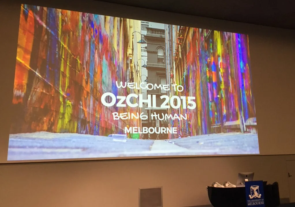
Last Xmas I (gave you my heart) wrote a piece about The Phenomenon of Automagic. I defined Automagic as when your users don't know how your app is working - it just works. Last week I was the OzCHI (The Australian Human Computer Interaction Conference) and Abi Sellen from Microsoft Research opening Keynote made me give automagic a second thought.


