UX of Everyday Things Series

Just a quick note to formally acknowledge my "UX of Everyday Devices/Things" themed posts are, of course, inspirited by the great Donald (Don) Norman and his influential book published in 1988: The Design of Everyday Things (DOET) (then the Psychology of Everyday Things POET). 

This book is the cornerstone of my UX journey; it was this that sparked my passion and made me realise other people were not only frustrated by the design of every day things, but were working to understand and change the way that people interact with technology and objects.

These posts are my experience, interpretation and observations of the UX of Everyday Things (UETS) and will be an ongoing theme I write about.  

My much loved copy of DOET

My much loved copy of DOET

ProjectBJIW

There is a Cat Café opening in Melbourne and they are looking for staff. My good friend Veronica Dixon, a graphic designer with her own freelance company Elvedee Designs, decided she would love to work at the Cat Café because of her love of cats and coffee; the flexibility freelancing affords gives her the ability to peruse this position.

Not satisfied with any ordinary application, Veronica decided that she would showcase her design skills in her application, or should I say cat-pplication, and thus project BJIW (Best Job In the World) was born.

Over the weekend of July 12th to July 13th we joined our graphic design and UX design skills, with ‘cat-piration’ from felines Pinni and The Fluff; with our powers combined we:

-          Incepted ProjectBJIW;

-          Started tweeting to gather interest;

-          Used a scrum board with hourly stand ups to keep us on track;

-          Created tasks to reach our goals, and;

-          Achieved our three main projects:

1.      A ‘recommendation video’ from Pinni the cat recommending her human, Veronica, for a job at the Cat Café Melbourne

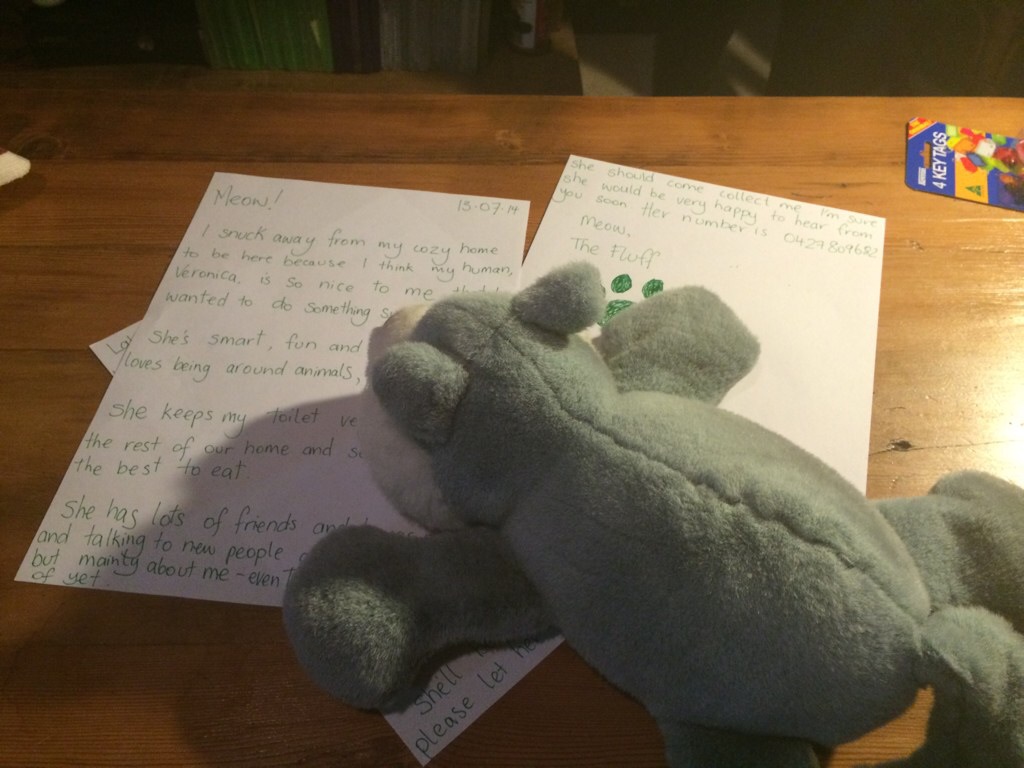
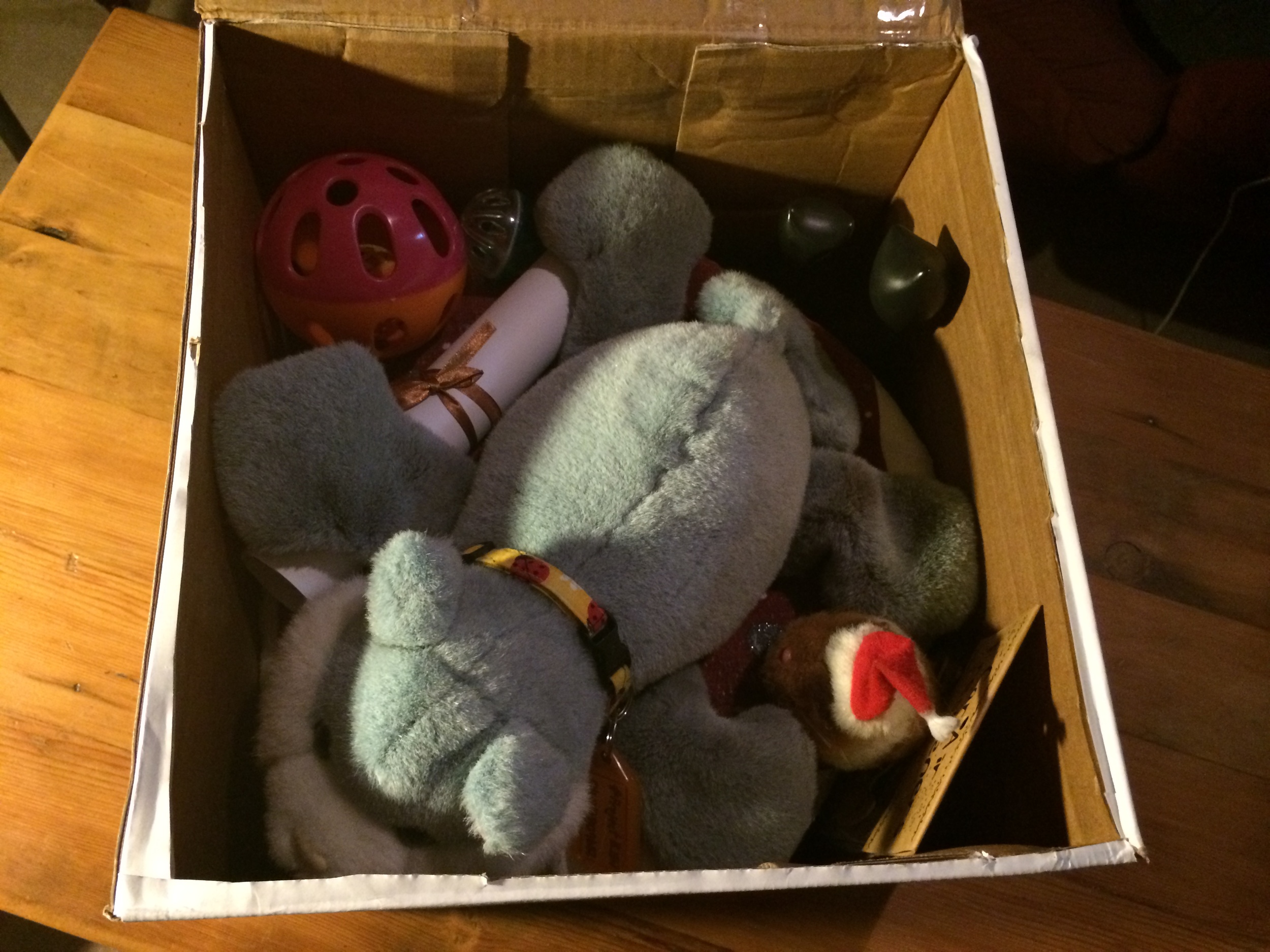
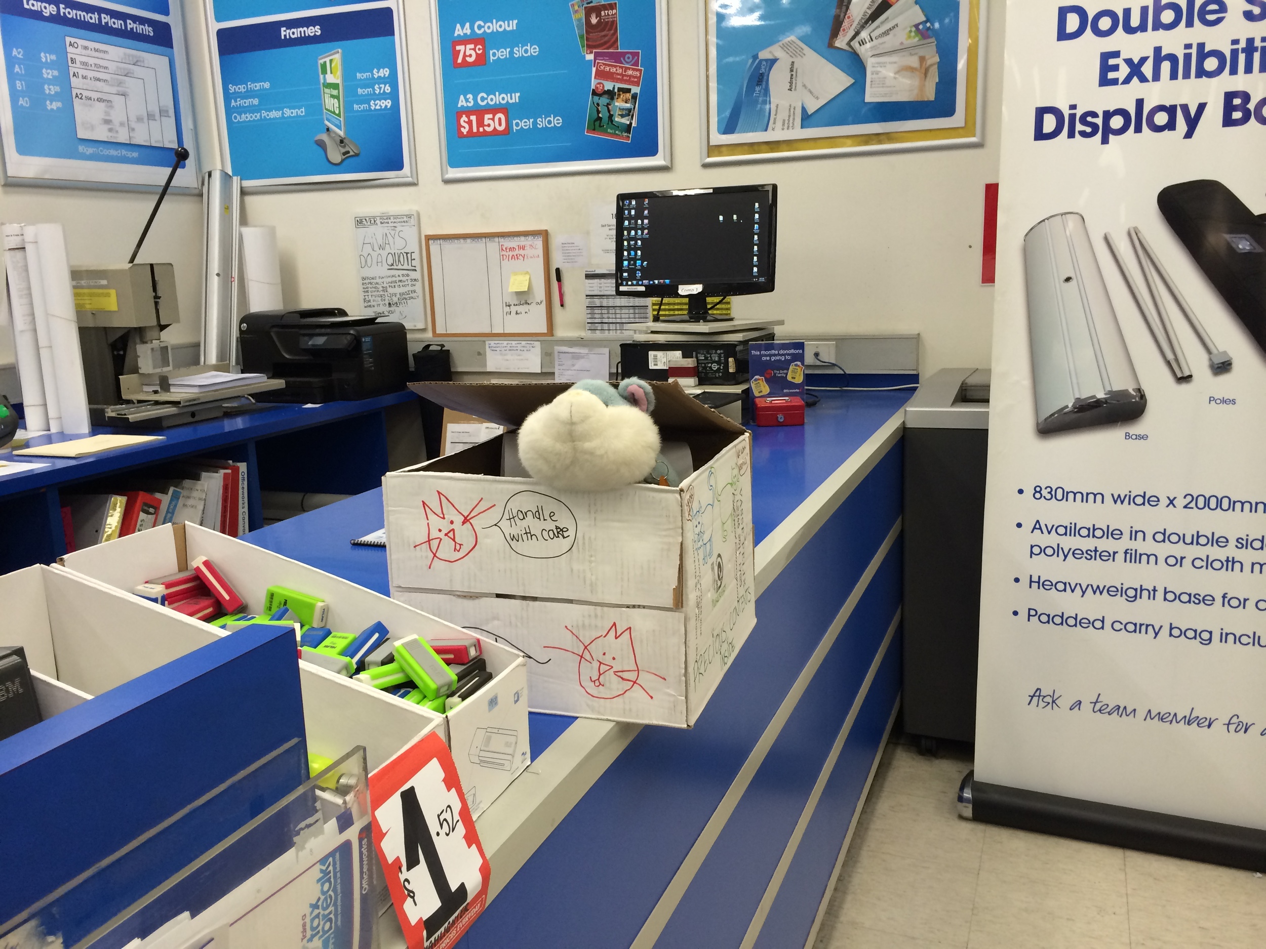
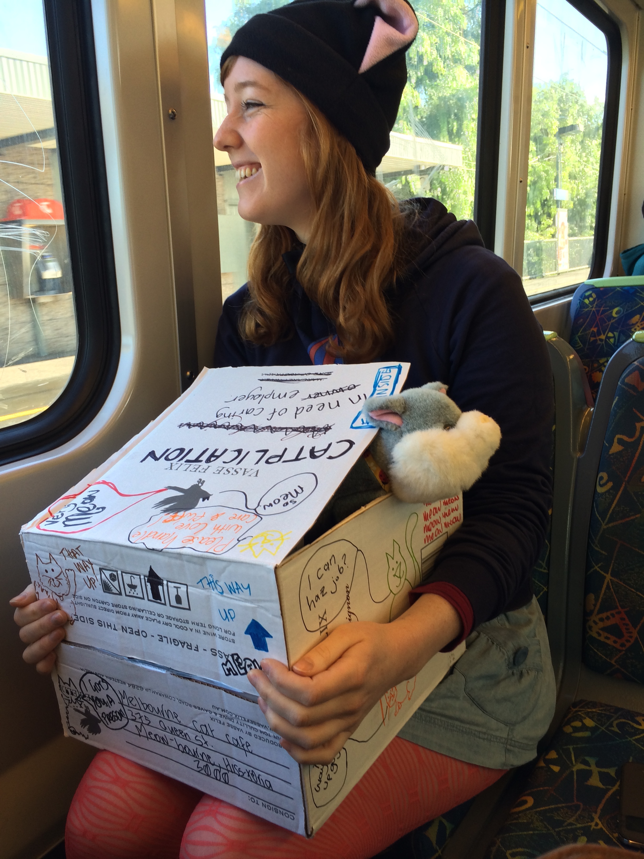
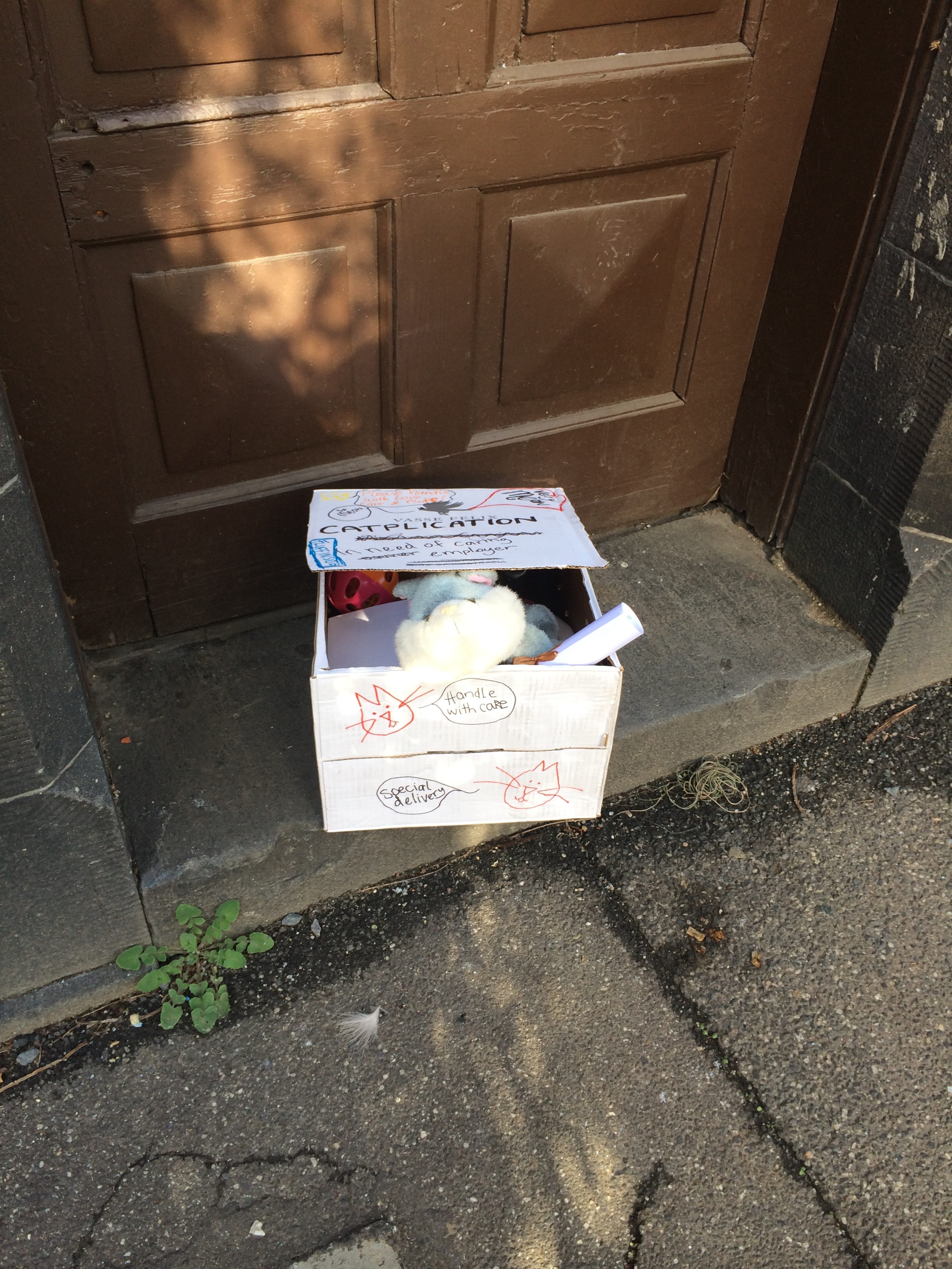
2.      A care-package from The Fluff recommending her human, Veronica, for a job at the Cat Café Melbourne with items to donate to the cat café

3.      A behind-the-scenes look at ProjectBJIW

 Recommendation Video

Veronica loves cats, and looks after them better than anyone else in Melbourne… who would know better than her cat Pinni! We helped Pinni to create a video to show Cat Café Melbourne why they should hire Veronica. The video is available here

 Care Package

The Fluff gathered a box, wrote a letter of recommendation and hitchhiked into the city (which is difficult without opposable thumbs) to print Veronica’s resume and wait at the Cat Café Melbourne with some toys to donate. We’re still waiting to hear back on whether or not The Fluff successfully persuaded the Cat Café but hasn't returned home yet.

 Behind-the-scenes

As typical graphic and UX designers, Veronica and I documented our processes from inception to completion.

The major tasks we completed were:

-          Ideation of the concept including mind-mapping and task creation (collaborative)

-          ‘Sprint’ planning (UX)

-          Designing and creating Veronica’s resume (Graphic Design)

-          Designing and creating the letter from The Fluff (Graphic Design)

-          Creating and packing The Fluff’s box (Graphic Design)

-          Decorating The Fluff’s box (Graphic Design with collaborative construction)

-          Writing the script and direction for the recommendation video (collaborative)

-          Filming, editing and producing the video (UX), and;

-          Social media awareness (UX with collaborative contribution).

 The behind-the-scenes video is available here, and the Twitter trail here


 Stay tuned for updates on ProjectBJIW! 


UX of Everyday Things - Ultrasounds

Today I has an ultrasound; nothing serious or exciting to report, other than my UX observations. 

The machine used was a Phillips xMatrix not dissimilar to the device pictured, taken from  www.jakenmedical.com. 

Being a UX designer, while trying to take my mind off the procedure, I was studying the buttons and making mental notes about how the operator knew just what to do with these seemingly randomly placed, and unlabelled, buttons and how much training he must have had. This confusing interface lives in an environment where mistakes must be eliminated. 

As he was operating the machine I noted the positives of his experience. The machine enabled him to attach different sized sensors, with long cables to reach the patient (i.e me) without dislodging from the ports. The machine is "easily" operated with one hand, while the other is used to manipulator the sensors over the patients body. 

I was thinking how well everything was going, all about the UX when I experienced the bad UX I thought such a confusing design afforded - the operator had been entering the wrong labels on the images, and there was no way for the system to go back and change the label to what the organ really was. He then had to delete said images, and redo those parts of the ultrasound, giving me a prolonged ultrasound and a negative experience for all.

My 20 minute ethnography was insightful, it would be an interesting exercise to redesign these machines to improve the UX for both patient and operator.