
Safe-D
Smartphone devices have become ubiquitous, and with this e-health apps common. However, the efficacies of e-health apps vary greatly due to lack of behavioural change theory, scientific foundations and healthcare professional involvement in development.
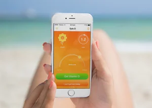
My masters research leveraged the Safe-D case study to develop an app, also named Safe-D, to improve vitamin D status in young women, safely, through persuading UV exposure. It was designed for young women aged 16-25 to provide tailored recommendations regarding UV exposure requirements to improve vitamin D status safely without increasing skin cancer risk.
The app was created for use in a Randomised Controlled Trial (RCT) conducted by The University of Melbourne and The Royal Women's Hospital to determine whether or not an app could improve vitamin D status as well as, or better than, paper-based information and/or supplementation.
The main challenge of the app was providing individualised recommendations, as UV exposure is affected by multiple factors, both individual and location based.
What impacts individual safe sun exposure time
Publications

The potential of eHealth Apps to Support Targeted Complex Health Messages
Journal of General Practice

UX process
The app was developed using participatory action research with a large upfront focus to understand the complexities of vitamin D.
The app concept was workshopped in a group, and I was responsible for creating the UI sketches and UX design. My designs were turned in to high-fidelity mockups by a graphic designer, and these were run through a heuristic evaluation. Designs were validated with target users in focus groups, an advisory Facebook group and guerrilla testing. The app was beta tested extensively including an expert review.
The app design leveraged the following:
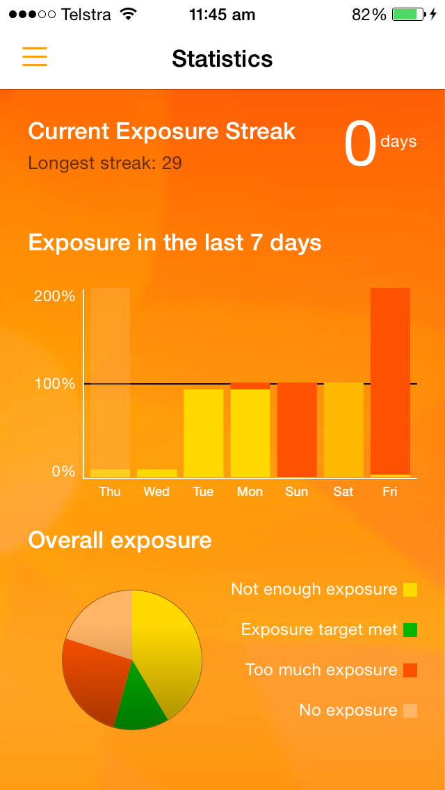
Gamification in the form of a 'streak' to encourage repeated use
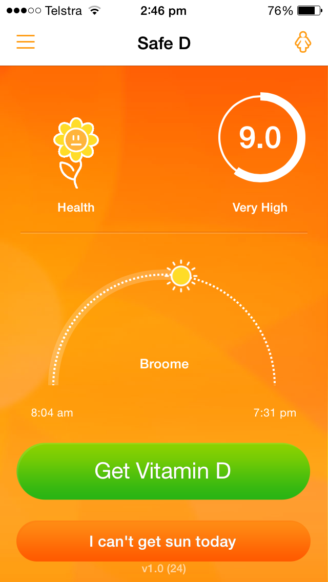
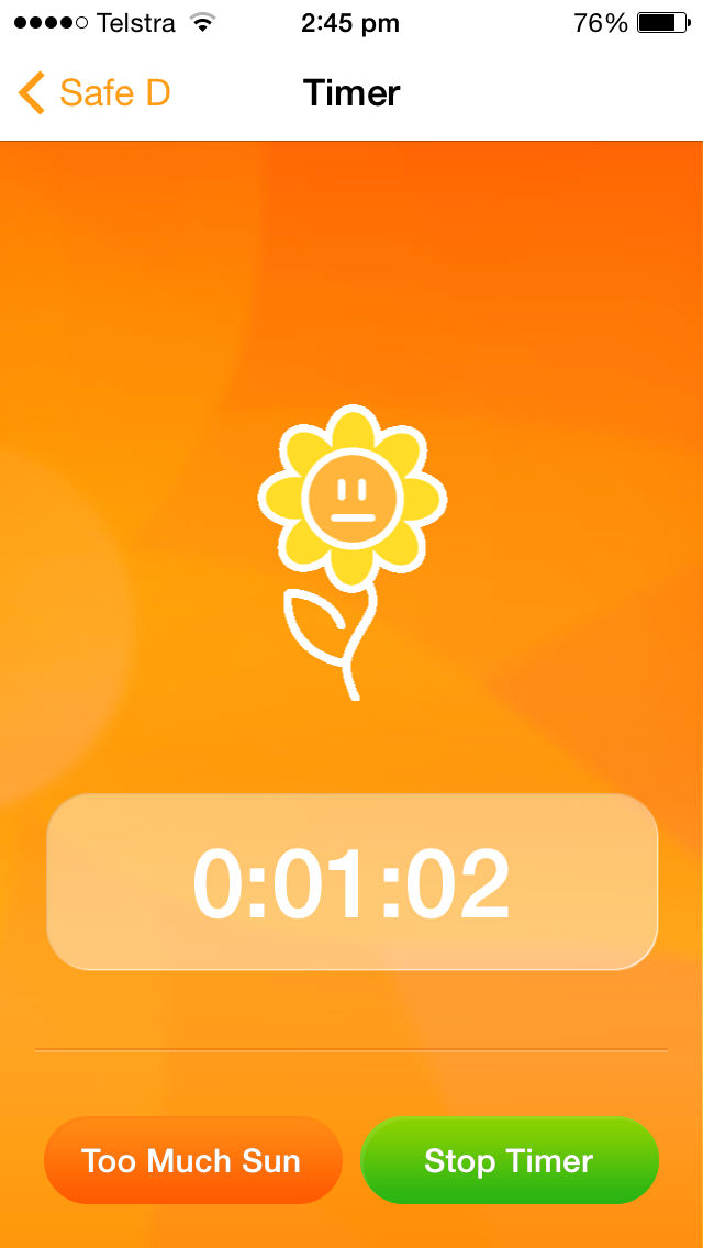
Gamification using a sunflower that would grow and bloom when recording sun exposure. The sunflower would burn if the user was exposed for too long to reiterate prolonged sun exposure risks and influence safe behaviour.
Monitoring of weekly and all-time exposure records to promote behaviour change.
Safe sun exposure has a “goldilocks zone” as exposure can be too high, too low or just right. Inspiration was leveraged from diabetes displays, which also has a goldilocks zone, integrated with a traffic light system where ‘just right’ is green, ‘too high’ is red to signal danger and ‘too low’ is yellow to indicate it is sub-optimal without reprimanding the user. If I were designing this today, I would ensure the colours chosen were more accessible.
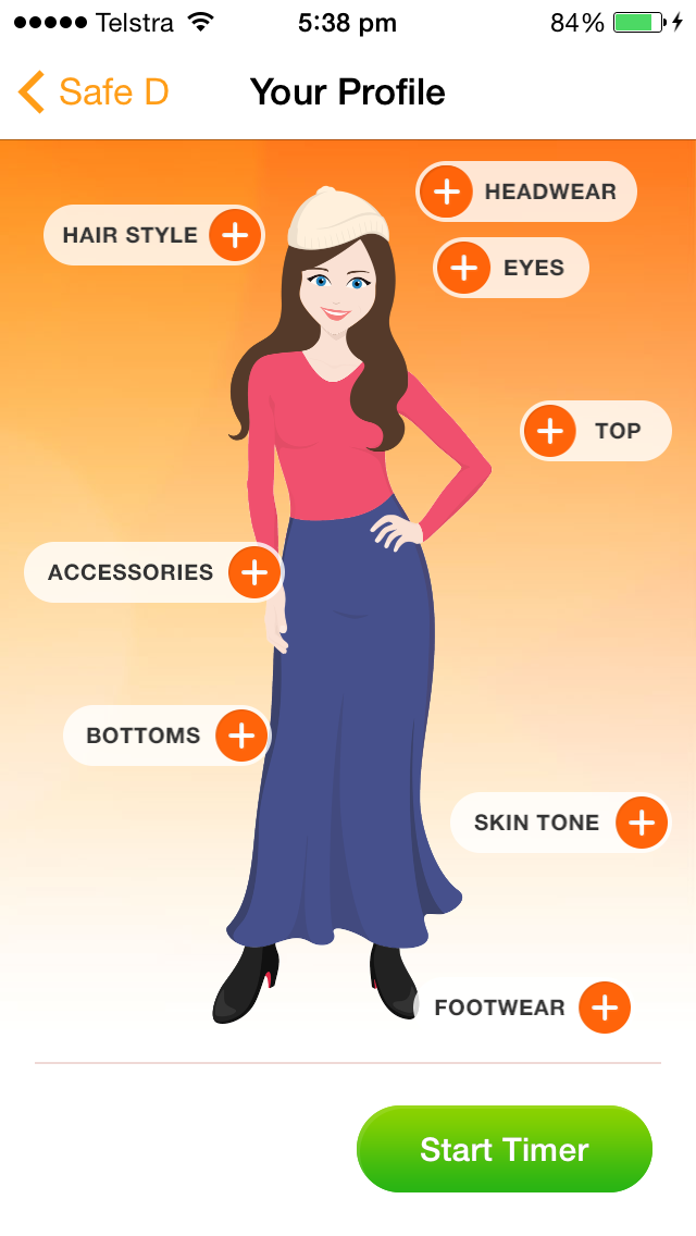
As sun exposure depends on skin exposure, an avatar is utilised to ‘dress’ and determine how much skin is exposed . There were extensive UX considerations regarding the avatar and clothing options. The avatar must not propagate unrealistic body image for young women and cultural customisations were considered such as hijabs, burkas and other religious coverings. For usability the avatar defaults clothing from the last exposure, removing a step if exposed skin remains stable exposure-to-exposure.
Results
Through preliminary surveys, and usability testing, we learned our users:
Thought 1-push notification per day was acceptable when they were interacting with the app explicitly
Did not like notifications when they were not using the app
Preferred touch-input over typing
Liked push notifications that reminded them to do something, rather than needing to recall it themselves.
Improvements were made to:
Enable the 'Next' and 'Go' keyboard options to move through fields quickly
Store static information rather than prompting for it
Default inputs to last used, to remove a step if they remain unchanged which they often did within days of similar weather.
Outcomes
Beta testers anecdotally noted behaviour change and learning from using the app.
The over-all success of the app was determined by the outcome of the RCT. It found that the app improved Vitamin D status better than paper-based information, but not better than a daily supplement.